ShopDreamUp AI ArtDreamUp

Deviation Actions


Description
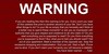
"Eternal suffering for dummies"
Please sign up for the RSS feed so you'll know when the site goes live, and we can gauge the demand for the site.
I came up with the concept so we could add some comic relief to the site and again, I used *stock images (See damn it all to hell--www.damnitalltohell.com). Fookleyur (my writer partner) says he'll come up with actual content for the book--can't wait!
Artist who want to contribute, please visit my blog and look for special projects.
Thanks to the *DA stock artists for their work:
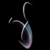
posers by mjranum_stock [link]
Please sign up for the RSS feed so you'll know when the site goes live, and we can gauge the demand for the site.
I came up with the concept so we could add some comic relief to the site and again, I used *stock images (See damn it all to hell--www.damnitalltohell.com). Fookleyur (my writer partner) says he'll come up with actual content for the book--can't wait!
Artist who want to contribute, please visit my blog and look for special projects.
Thanks to the *DA stock artists for their work:
posers by mjranum_stock [link]
Image size
658x789px 397.41 KB
Comments12
Join the community to add your comment. Already a deviant? Log In
Hello, here from #GoldenCritique-Club
Looking at this image I through it would be for a satire website, but I went to the site and it looks like it will be more on the different types of hell across various religions/mythos?
I really like the font used for "eternal suffering". Looks awesome and is definitely appropriate. Great work on the figures that you chose. The twisted, tense poses really convey a feeling of pain and discomfort, especially paired with the facelessness of the body suit. The little death-like figure in the corner is a nice touch.
A few things for critique:
-Not a big fan of the red bars on the side. That color red is kind of harsh for large areas in a design. I'd suggest something more muted or darker.
-The one blue figure looks kind of strange, when the other four are some sort of desaturated brown
-You have three domain names listed which is confusing. I get the bottom one is to your main art site. But why have both the "dammitalltohell" and the "diath" names listed, especially when the diath one, after a couple clicks, leads to the dammitalltohell one anyway?
Hope this is useful!